12 Famous Logos With a Secret Meaning
A logo is the face of a brand, and we often buy this or that item because its “face” is well-known to the world. Come on, don’t deny it! As for the best logos, they convey a hidden subtext that represents the company’s values, goals, or history. So, here are 12 world-famous logos with a secret hidden meaning!
TIMESTAMPS:
Airbnb 1:15
TripAdvisor 2:02
MasterCard 2:55
Dell 3:53
National Geographic 4:26
Vodafone 5:08
Haribo 6:00
Subway 6:37
DC Comics 7:29
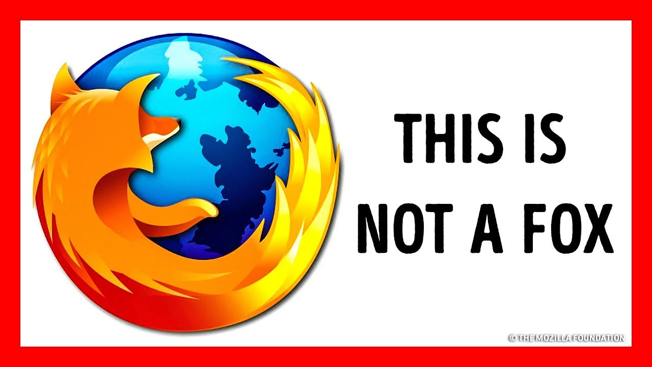
Mozilla Firefox 8:15
Bacardi 9:09
Orbit 9:42
Preview photo credit:
Firefox logo used since June 2013 (version 23.0 Beta), Previous version of logo, used since Firefox 3.5: By © The Mozilla Foundation, CC BY 3.0 https://creativecommons.org/licenses/by/3.0/deed.es, https://es.m.wikipedia.org/wiki/Archivo:Mozilla_Firefox_logo_2013.svg
Animation is created by Bright Side
Music: https://www.youtube.com/audiolibrary/music
SUMMARY:
– The logo contains 4 simple yet meaningful elements: the head of a person that represents a user of their site, the sign for a location on a map to show where the house or apartment is, a heart to represent love, and, finally, all of these symbols combine to make the letter “A” for Airbnb.
– TripAdvisor’s logo is an owl, which symbolizes wisdom and knowledge. As for its different-colored eyes, they show that each traveler has a choice to make: green means go, and red means no!
– The international payment system we all know these days as MasterCard was established in 1966 as Interbank. Red stands for bravery, passion, and for doing what makes you feel joy. The bright yellow symbolizes prosperity.
– Ever wonder why the “E” in Dell’s logo is all askew? Well, the founder of the company, Michael Dell, wanted to convey the meaning of the popular idiom “turn the world on its ear,” which means to change something in an exciting way.
– National Geographic, the popular magazine and channel that broadcasts documentaries in 171 countries, made its logo a yellow rectangle. The rectangle symbolizes a door that’s open to the world of knowledge about nature, science, and culture. Yellow and bright just like the Sun.
– Vodafone is a British mobile provider that operates mostly in Europe, Asia, Africa, and Oceania. The company chose a couple of mysterious things for its logo, which looks sort of like an earphone. The designers wanted to show that, with Vodafone, users can talk to each other any time they want.
– The Haribo’s founder combined the first 2 letters of his first and last name, Hans Riegel, and added the first 2 letters of his hometown of Bonn.
– The arrows on the first and last letters of the Subway logo are there for a reason: they actually stand for the entrance and exit to the subway. This way, the company demonstrates that, with Subway, you can eat on the go, like in the actual subway!
– Jim Lee revealed what the new logo of DC Comics actually means. The nooks and angles are meant to evoke the Superman “S” symbol, the Wonder Woman “WW” emblem, and the Bat-Signal.
– “Firefox” is the English translation of the Chinese name for a red panda. This way, the company wanted to demonstrate how unique they are because this is a very rare kind of panda that’s actually endangered.
– The legend goes that the wife of Bacardi’s co-founder saw a bat in their liquor factory. But instead of getting scared and running for the exit, he took it as a sign and decided that this was exactly what should be on the logo.
– If you look closely at the Orbit’s logo, you’ll notice that the capital “O” is split into 2 parts: one dark and one light. In the background you can see the image of an orbit. So, it’s clear that the “O” symbolizes day and night and a planet revolving around the Sun.
Subscribe to Bright Side : https://goo.gl/rQTJZz
—————————————————————————————-
Our Social Media:
Facebook: https://www.facebook.com/brightside/
Instagram: https://www.instagram.com/brightgram/
5-Minute Crafts Youtube: https://www.goo.gl/8JVmuC
—————————————————————————————-
For more videos and articles visit:
http://www.brightside.me/


![[ID: jvNU5bwzclI] Youtube Automatic](https://bizimtube.com/wp-content/uploads/2021/03/id-jvnu5bwzcli-youtube-automatic-236x133.jpg)
![[ID: 0yCJMt9Mx9c] Youtube Automatic](https://bizimtube.com/wp-content/uploads/2021/03/id-0ycjmt9mx9c-youtube-automatic-236x133.jpg)
![[ID: vAJM5EdDwjU] Youtube Automatic](https://bizimtube.com/wp-content/uploads/2021/03/id-vajm5eddwju-youtube-automatic-236x133.jpg)
![[ID: LxOmofEFub4] Youtube Automatic](https://bizimtube.com/wp-content/uploads/2021/03/id-lxomofefub4-youtube-automatic-236x133.jpg)
![[ID: wFAh77GBsHs] Youtube Automatic](https://bizimtube.com/wp-content/uploads/2021/03/id-wfah77gbshs-youtube-automatic-236x133.jpg)
![[ID: tjwrG4Debc4] Youtube Automatic](https://bizimtube.com/wp-content/uploads/2021/03/id-tjwrg4debc4-youtube-automatic-236x133.jpg)
![[ID: _28bYGZtnU8] Youtube Automatic](https://bizimtube.com/wp-content/uploads/2021/03/id-28bygztnu8-youtube-automatic-236x133.jpg)
![[ID: 1e7bhUjUEJ8] Youtube Automatic](https://bizimtube.com/wp-content/uploads/2021/03/id-1e7bhujuej8-youtube-automatic-236x133.jpg)
![[ID: QjyCviSKY2U] Youtube Automatic](https://bizimtube.com/wp-content/uploads/2021/03/id-qjycvisky2u-youtube-automatic-236x133.jpg)
![[ID: -5i-vB4-kFk] Youtube Automatic](https://bizimtube.com/wp-content/uploads/2021/03/id-5i-vb4-kfk-youtube-automatic-236x133.jpg)
![[ID: covHhQgr5kU] Youtube Automatic](https://bizimtube.com/wp-content/uploads/2021/03/id-covhhqgr5ku-youtube-automatic-236x133.jpg)
![[ID: mX7FEHws43A] Youtube Automatic](https://bizimtube.com/wp-content/uploads/2021/03/id-mx7fehws43a-youtube-automatic-236x133.jpg)